
Calendar Heatmap Visualization
Category
Plug-insOverview
This is not an officially supported Google product.
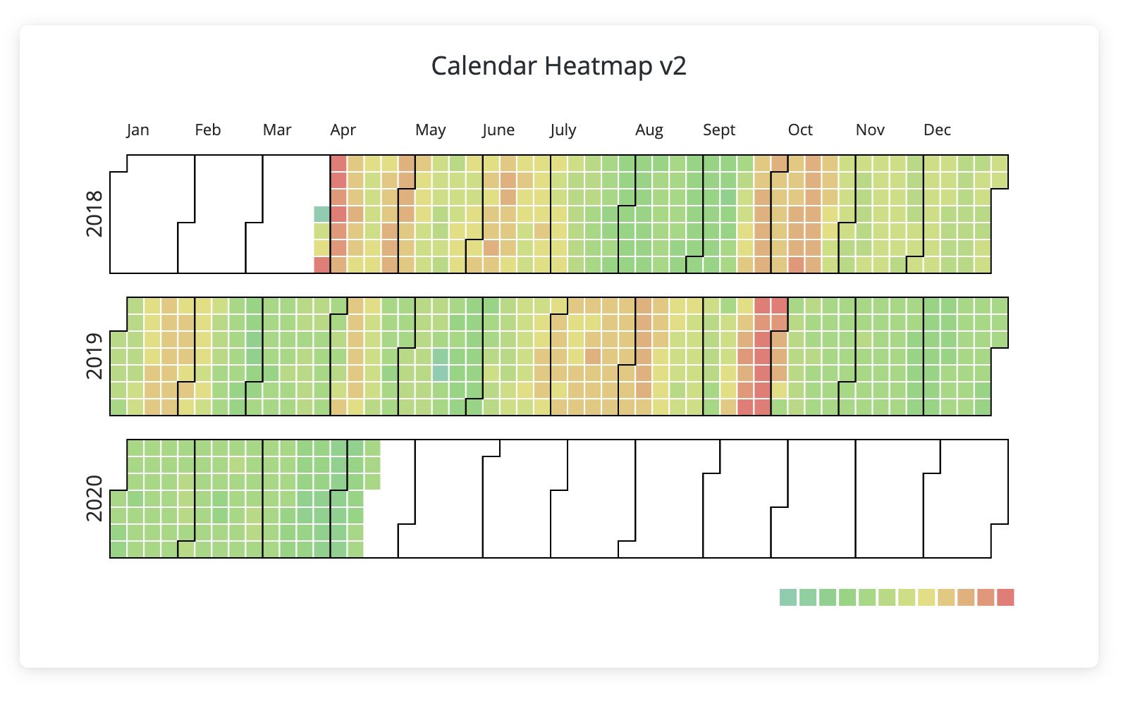
Use the Calendar Heatmap to highlight trends and anomalies over time. The Calendar Heatmap visualizes time-series data displayed over a conventional calendar year. Individual days, weeks, and years are shaded on a light-to-dark gradient based on the numerical value provided to the visualization.
Other examples of calendar heatmaps include Github’s contributions over time visualization and this illustration in a WSJ article plotting infectious disease trends over time.
The example below shows the number of polls in which a specific political candidate’s name was included. The Calendar Heatmap visualization makes it easy to see that their name was floated most in mid-March and sparingly after, with slight surges following the next two debates in June and September. This visualization requires one date-type dimension and one measure.