
Chord Visualization
Category
Plug-insOverview
This is not an officially supported Google product.
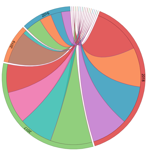
A chord diagram represents the flows and connections between multiple entities (called “nodes”, represented as dimensions in Looker). Each entity is represented by a specific segment on the outer part of the circle. “Arcs” are drawn between each entity. The size of the arc is proportional to the weight of the flow. In the example below, we can see the flow of users by gender over the course of several years. The first dimension represents the starting point for each arc. In the example below, “gender” is the first dimension, “created_year” is the second dimension, and “count” is the measure. Other examples of chord diagrams have been used to depict Uber trips within San Francisco and customers switching between various mobile phones brands. This visualization requires two dimensions and one measure.