
Histogram Visualization
By Google
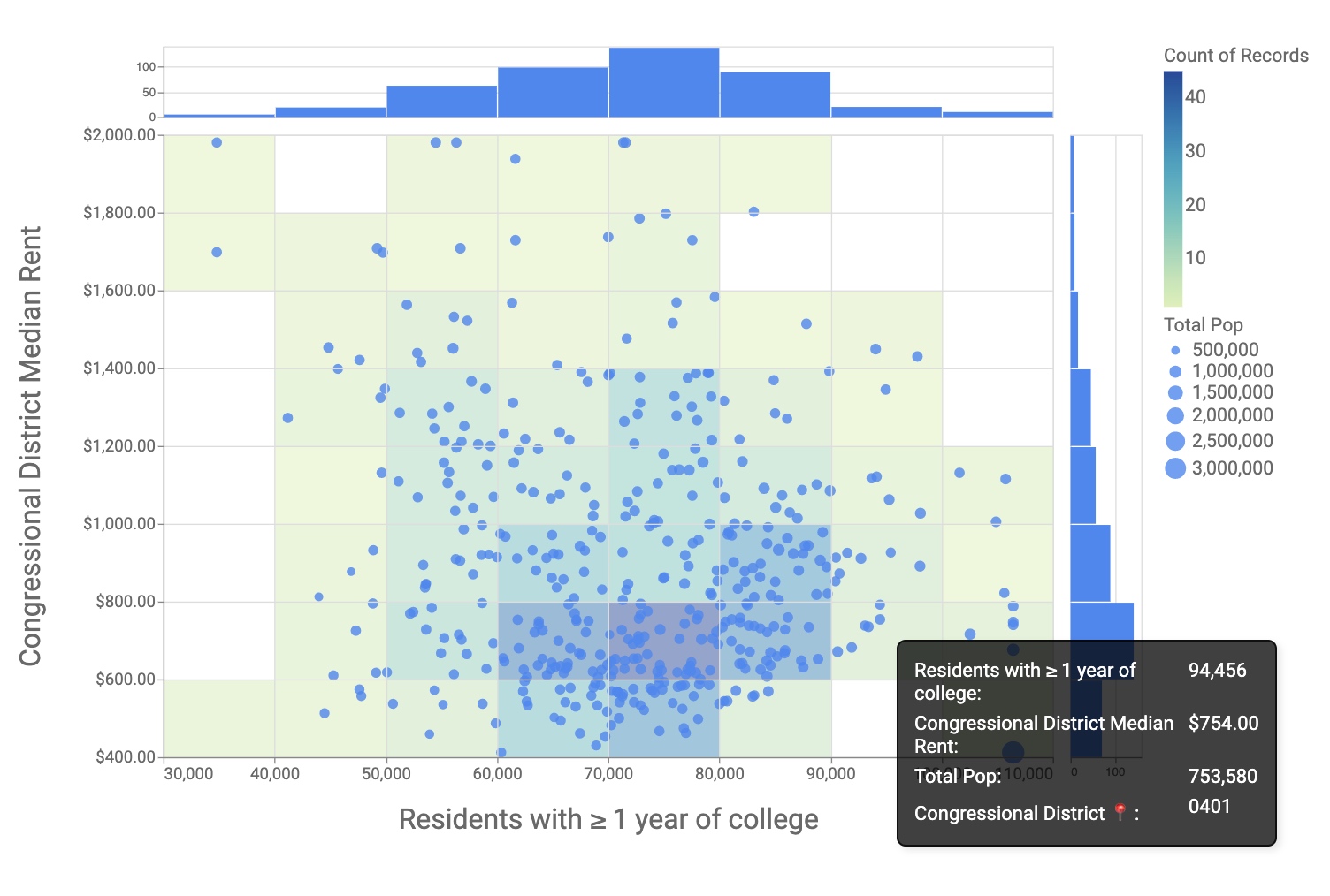
Use the Histogram Visualization to quickly identify frequency distributions of aggregate data.
Use the Histogram Visualization to quickly identify frequency distributions of aggregate data.
Category
Plug-insOverview
Install this plug-in for free by importing the project(s) from the GitHub repository linked at the top of the listing.
This is not an officially supported Google product.
NOTE: This visualization is subject to standard Explore row limits (max 5,000 rows). If dealing with more than 5,000 rows, please consider creating a tiered dimension and using the native column chart. Easily see the "shape" of your data with the Histogram Visualization. Useful for quickly binning measures within 5,000 rows. This visualization will help you:
- Show the frequency distributions of a single measure or compare distributions of two measures.
- Quickly adjust bin sizes without changes to your LookML.
- Drill down to see the indivudal rows that fall into each bin.
Refer to the README for more feature details and instructions.